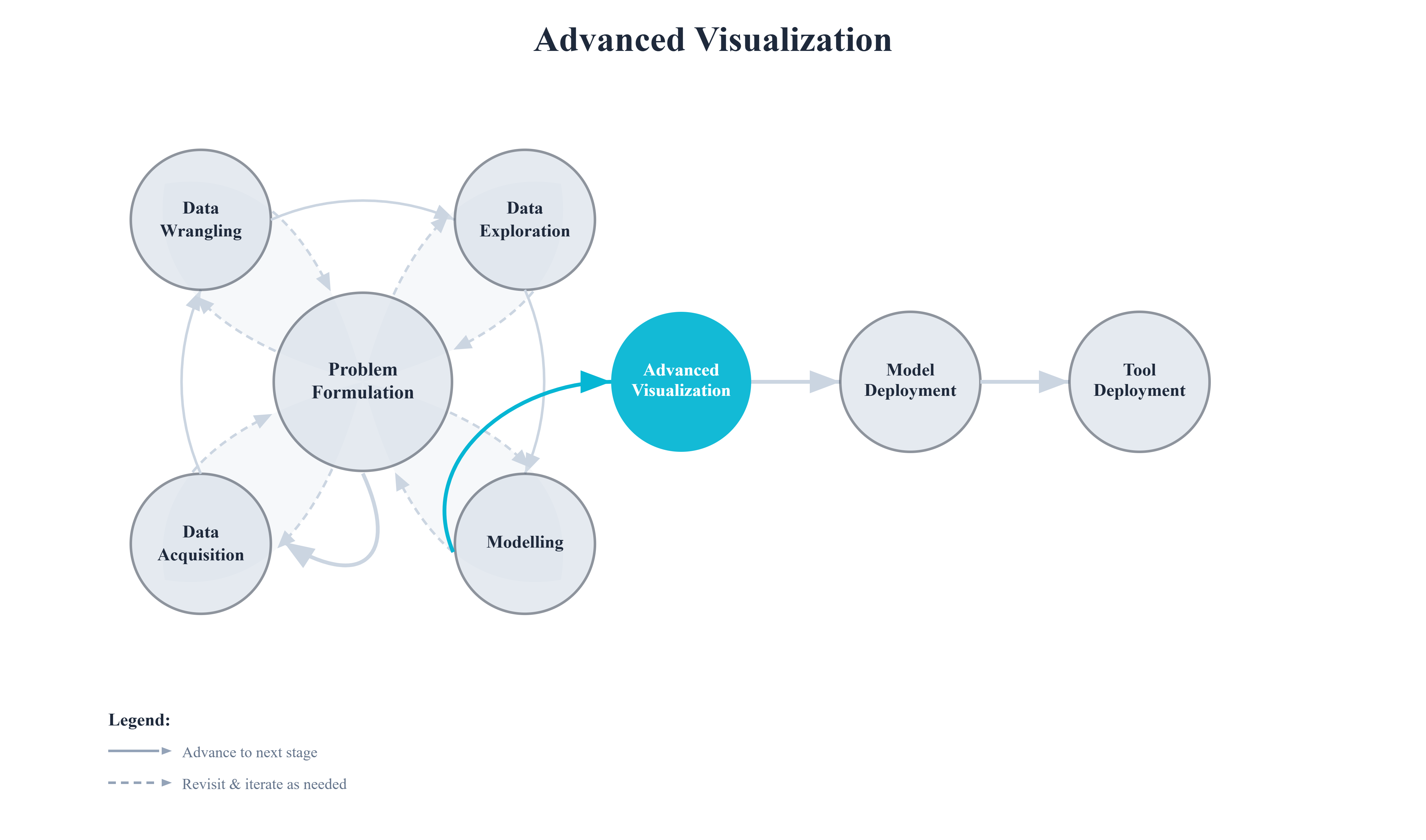
7. Advanced Visualization#
A plot is a one-way communication. The author decides what to show, and the reader absorbs it. That arrangement works fine for a finished report, but it falls short during the messy middle stages of data science — when you are still trying to understand your data, tune your model, or explain a prediction to a colleague.
This chapter is about closing that gap. We will move from static images that answer a single, fixed question to interactive visualizations that let the viewer ask questions of their own.
The Limits of a Static Plot
Consider the classic Iris dataset. A standard matplotlib scatter plot gives us a snapshot — sepal length against sepal width, coloured by species. It answers exactly one question: do the three species separate on these two axes?
import matplotlib.pyplot as plt
from sklearn.datasets import load_iris

iris = load_iris()
X, y = iris.data, iris.target
species = [iris.target_names[i] for i in y]

fig, ax = plt.subplots(figsize=(7, 5))
for i, name in enumerate(iris.target_names):
    mask = y == i
    ax.scatter(X[mask, 0], X[mask, 1], label=name, alpha=0.7,
               edgecolors='k', linewidths=0.4)

ax.set_xlabel(iris.feature_names[0])
ax.set_ylabel(iris.feature_names[1])
ax.set_title("Iris Dataset — Sepal Length vs Width")
ax.legend()
plt.tight_layout()
plt.show()
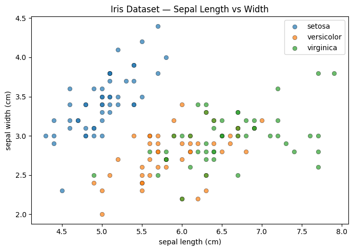
The plot is clear. But now ask yourself: which exact point is that outlier in the setosa cluster? What are its petal measurements? Is it actually an outlier, or does it look that way only on these two axes? A static image cannot answer any of those follow-up questions. You would have to write new code and generate a new plot — and repeat that for every question.
Giving the Plot a Voice
Now look at the same data rendered with Plotly.
import plotly.express as px
import plotly.io as pio
import pandas as pd

pio.renderers.default = "notebook"

df = pd.DataFrame(X, columns=iris.feature_names)
df['species'] = species

fig = px.scatter(
    df,
    x=iris.feature_names[0],
    y=iris.feature_names[1],
    color='species',
    hover_data=iris.feature_names,
    title="Iris Dataset — Sepal Length vs Width (interactive)",
    template='plotly_white',
)
fig.show()
The code is almost identical. The result is fundamentally different. Hover over that outlier and all four measurements appear immediately. Click a species name in the legend to isolate or hide it. Drag to zoom into a crowded region. Pan to recenter. Every question you had about the static version can now be answered directly, without touching the code at all.
That shift — from a fixed answer to an open question space — is the core idea of this chapter.