5.3.2. Multivariate Distributions#
So far, we have examined distributions of single features. In real datasets, features rarely act in isolation. Instead, multiple features vary together, forming a multivariate distribution.
A multivariate distribution describes how several features jointly behave and interact.
Because direct visualization becomes difficult as dimensionality increases, multivariate structure is often explored through:
Summary statistics across multiple features
Correlation matrices
Pairwise projections
Dimensionality reduction techniques
Understanding multivariate structure helps identify:
Redundant or highly correlated features
Groups of features that move together
Opportunities for feature reduction or transformation
Once features are on comparable scales and viewed from a multivariate perspective, we can begin examining how they vary together. One of the most common and useful tools for understanding feature–feature relationships is correlation.
Correlation measures the strength and direction of a relationship between two numeric features. It helps identify dependencies, redundancies, and patterns that may be useful for modeling or interpretation.
5.3.2.1. Scatter Plots#
A scatter plot provides the most direct visual representation of the relationship between two features. Each point corresponds to a single observation, with one feature plotted on the x-axis and the other on the y-axis.
Scatter plots help reveal:
Linear or nonlinear relationships
Clusters or subgroups
Outliers that may influence statistics
Example: Track Length vs File Size
import sqlite3
import pandas as pd
import matplotlib.pyplot as plt

# Connect to Chinook sample database
conn = sqlite3.connect("../data/chinook.db")

# Load the 'tracks' table into a DataFrame
df_tracks = pd.read_sql_query("SELECT * FROM tracks", conn)

plt.figure(figsize=(8, 6))
plt.scatter(df_tracks["Milliseconds"], df_tracks["Bytes"], alpha=0.5)
plt.xlabel("Milliseconds")
plt.ylabel("Bytes")
plt.title("Track Length vs File Size")
plt.show()
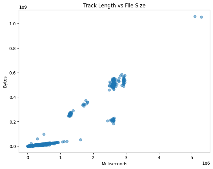
This plot shows a clear positive relationship. As track length increases, file size also increases, which matches our intuition.
5.3.2.2. Correlation Coefficient#
While scatter plots provide visual intuition, correlation provides a numerical summary of linear dependence.
The most commonly used measure is Pearson’s correlation coefficient, defined as:
\( r(X, Y) = \frac{\sum_{i=1}^{N} (X_i - \mu_X)(Y_i - \mu_Y)} {\sqrt{\sum_{i=1}^{N} (X_i - \mu_X)^2 \sum_{i=1}^{N} (Y_i - \mu_Y)^2}} \)
Where:
(X) and (Y) are the two features
(\mu_X) and (\mu_Y) are their means
(N) is the number of observations
Note
Pearson correlation measures linear relationships only. Strong nonlinear relationships may exist even when correlation is close to zero.
5.3.2.3. Interpreting Correlation Values#
Correlation values range from -1 to 1:
+1: perfect positive linear relationship
-1: perfect negative linear relationship
0: no linear relationship
In practice:
Values near ±1 indicate strong relationships
Values near 0 indicate weak or no linear dependence
Correlation does not imply causation. A high correlation indicates association, not a cause-and-effect relationship.
5.3.2.4. Correlation Matrix#
In datasets with many numeric features, computing correlation pair by pair is inefficient. A correlation matrix summarizes all pairwise correlations in a single table.
import seaborn as sns

corr = df_tracks.corr(numeric_only=True)

plt.figure(figsize=(10, 6))
sns.heatmap(corr, annot=True, cmap="coolwarm")
plt.title("Correlation Matrix")
plt.show()
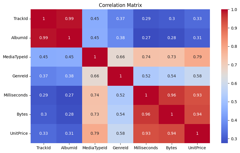
Correlation matrices help identify:
Groups of strongly related features
Redundant variables
Potential multicollinearity in linear models
5.3.2.5. Correlation with a Target Variable#
In supervised learning settings, it is often useful to examine how features relate to a specific target variable. This can guide feature selection and improve interpretability.
Example: Correlation with Bytes
target = "Bytes"
correlations = corr[target].drop(target)
correlations.sort_values(ascending=False)
Milliseconds    0.960181
UnitPrice       0.938482
MediaTypeId     0.732825
GenreId         0.544109
TrackId         0.301285
AlbumId         0.281840
Name: Bytes, dtype: float64
5.3.2.6. Summary#
Correlation provides a simple but powerful way to quantify relationships between features. Combined with visual tools such as scatter plots and heatmaps, it helps uncover structure, redundancy, and patterns within the data.
While correlation focuses on feature–feature relationships, it does not describe how similar individual data points are to one another. In the next section, we shift our focus to example–example relationships, introducing similarity and distance measures.