6.2.2.1. Metrics and Loss Functions#
Before training any classifier, we need a way to measure: how good are its predictions? Unlike regression, where a real-valued error is natural, classification outputs discrete labels - so we need different tools.
The distinction between loss functions and evaluation metrics applies here too:
Loss functions drive optimisation during training (e.g. binary cross-entropy is differentiable and guides gradient descent).
Evaluation metrics communicate model quality after training in a task-meaningful way (e.g. precision and recall for imbalanced classes).
Loss Functions#
Binary Cross-Entropy (Log Loss)#
The standard loss for binary classification is binary cross-entropy, also called log loss. It measures the average negative log-probability assigned to the correct class:
where \(\hat{p}_i = P(\hat{y}_i = 1 | \mathbf{x}_i)\) is the predicted probability for the positive class.
A perfect model assigning probability 1 to the correct class every time yields \(\mathcal{L} = 0\).
A model that is confidently wrong is penalised very heavily because \(-\log(\varepsilon) \to \infty\) as \(\varepsilon \to 0\).
logloss = log_loss(y_test, y_prob)
The model achieves a log loss of 0.0679 on the held-out test set.
Categorical Cross-Entropy#
For \(K\)-class problems the loss generalises to:
Evaluation Metrics#
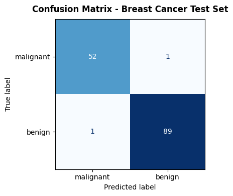
The Confusion Matrix#
Everything starts here. For binary classification, the confusion matrix counts the four possible outcomes:
Predicted Positive |
Predicted Negative |
|
|---|---|---|
Actual Positive |
TP (True Positive) |
FN (False Negative) |
Actual Negative |
FP (False Positive) |
TN (True Negative) |
cm = confusion_matrix(y_test, y_pred)

fig, ax = plt.subplots(figsize=(5, 4))
disp = ConfusionMatrixDisplay(confusion_matrix=cm,
                               display_labels=data.target_names)
disp.plot(ax=ax, colorbar=False, cmap='Blues')
ax.set_title("Confusion Matrix - Breast Cancer Test Set",
             fontsize=12, fontweight='bold', pad=10)
plt.tight_layout()
plt.show()
Accuracy#
The most intuitive metric, but misleading on imbalanced datasets. A model that always predicts the majority class achieves high accuracy without learning anything useful.
acc = accuracy_score(y_test, y_pred)
print(f"Accuracy: {acc:.3f}")
Accuracy: 0.986
Precision and Recall#
These two metrics capture the trade-off between false positives and false negatives - a balance that is crucial in most real-world problems.
Precision: Of all positive predictions, how many were correct? Relevant when false positives are costly (e.g. flagging legitimate emails as spam).
Recall (Sensitivity): Of all actual positives, how many did we catch? Relevant when false negatives are costly (e.g. missing a cancer diagnosis).
prec   = precision_score(y_test, y_pred)
recall = recall_score(y_test, y_pred)
print(f"Precision: {prec:.3f}")
print(f"Recall:    {recall:.3f}")
Precision: 0.989
Recall:    0.989
F1 Score#
The F1 score is the harmonic mean of precision and recall. It gives a single number that balances both concerns, penalising extreme imbalances between them:
f1 = f1_score(y_test, y_pred)
print(f"F1 Score: {f1:.3f}")
F1 Score: 0.989
ROC Curve and AUC#
The ROC (Receiver Operating Characteristic) curve sweeps the decision threshold from 0 to 1 and plots the True Positive Rate (Recall) against the False Positive Rate (1 − Specificity). A perfect classifier hugs the top-left corner; a random classifier lies on the diagonal.
The area under the ROC curve (AUC-ROC) summarises this into a single number in \([0, 1]\):
AUC = 1.0: perfect separation
AUC = 0.5: no better than random chance
auc = roc_auc_score(y_test, y_prob)
fpr, tpr, _ = roc_curve(y_test, y_prob)

fig, axes = plt.subplots(1, 2, figsize=(13, 5))

# ROC Curve
axes[0].plot(fpr, tpr, color='steelblue', lw=2,
             label=f'ROC curve (AUC = {auc:.3f})')
axes[0].plot([0, 1], [0, 1], 'k--', lw=1, label='Random (AUC = 0.5)')
axes[0].set_xlabel('False Positive Rate')
axes[0].set_ylabel('True Positive Rate (Recall)')
axes[0].set_title('ROC Curve', fontweight='bold')
axes[0].legend(loc='lower right')
axes[0].grid(True, alpha=0.3)

# Precision-Recall Curve
prec_arr, rec_arr, _ = precision_recall_curve(y_test, y_prob)
axes[1].plot(rec_arr, prec_arr, color='darkorange', lw=2)
axes[1].set_xlabel('Recall')
axes[1].set_ylabel('Precision')
axes[1].set_title('Precision-Recall Curve', fontweight='bold')
axes[1].grid(True, alpha=0.3)

plt.tight_layout()
plt.show()

print(f"AUC-ROC: {auc:.3f}")
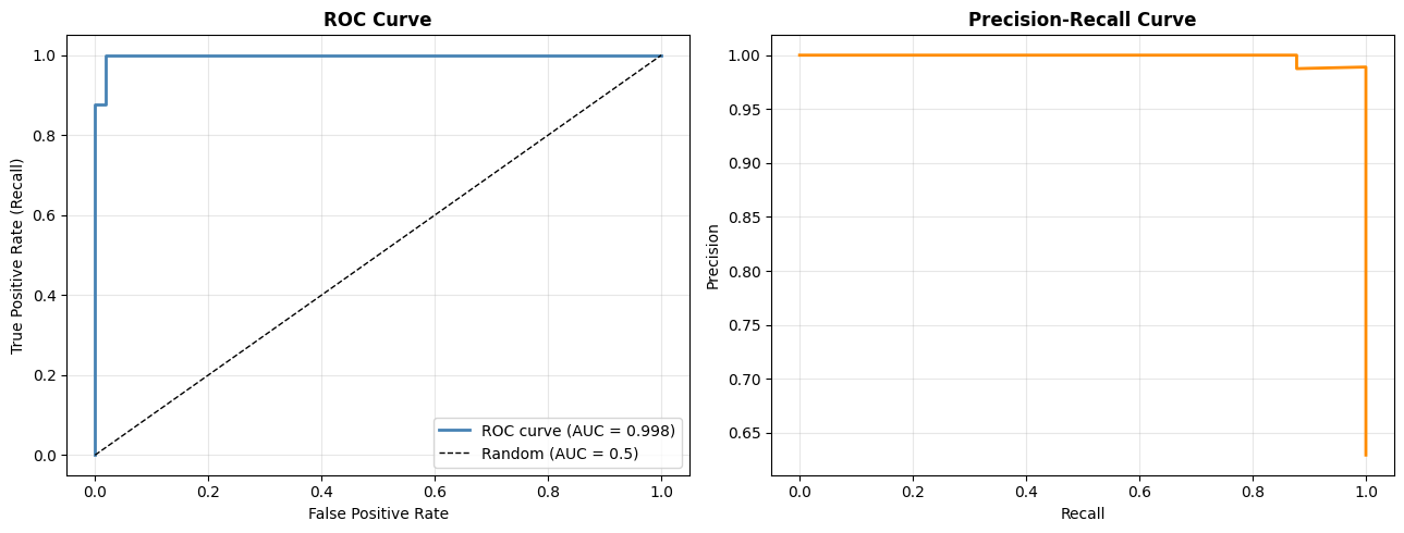
AUC-ROC: 0.998
Key takeaway: No single metric tells the whole story. Use accuracy for rough benchmarking, F1 when classes are imbalanced, AUC-ROC to compare models across thresholds, and always inspect the confusion matrix to understand the failure mode.