4.1.1. Handling Imperfections#
4.1.1.1. Noise and Outlier Handling#
As discussed earlier in Data Imperfections section, noise and outliers can distort statistical metrics and give an imperfect representation of the data. We can use statistical plotting techniques (like histograms or box plots, see univariate-distribution) to identify them.
Below, we will sometimes use noise and outliers interchangeably for illustration, but they are not the same. Noise often requires correction, smoothing, or imputation rather than simply truncating values. In some cases, noise cannot be corrected because there is no reliable way to recover or predict the true value, or it may be difficult to even identify which records are noisy.
Removing records#
One simple strategy is to drop extreme values. This works well when:
The number of outliers is small.
Dropping them does not significantly reduce dataset quality.
For smaller datasets, dropping rows can lead to poor modeling or analysis, so use this approach carefully.
Example: Using a salary dataset with an extreme outlier (CEO salary):
import pandas as pd
import numpy as np

# Example salary data
np.random.seed(0)
n = 20
salaries = np.random.randint(50_000, 200_000, size=n).tolist()
salaries.append(5_000_000)  # extreme outlier
df_salaries = pd.DataFrame({"Employee": list(range(1, n+2)), "Salary": salaries})
display(df_salaries)
| Employee | Salary | |
|---|---|---|
| 0 | 1 | 93567 |
| 1 | 2 | 167952 |
| 2 | 3 | 145939 |
| 3 | 4 | 147639 |
| 4 | 5 | 91993 |
| 5 | 6 | 172579 |
| 6 | 7 | 136293 |
| 7 | 8 | 162420 |
| 8 | 9 | 98600 |
| 9 | 10 | 102620 |
| 10 | 11 | 130186 |
| 11 | 12 | 67089 |
| 12 | 13 | 158631 |
| 13 | 14 | 151201 |
| 14 | 15 | 132457 |
| 15 | 16 | 187993 |
| 16 | 17 | 117699 |
| 17 | 18 | 120608 |
| 18 | 19 | 57877 |
| 19 | 20 | 133966 |
| 20 | 21 | 5000000 |
# Identify outliers (salaries > 250,000)
outliers = df_salaries["Salary"] > 250_000
df_salaries[outliers]
| Employee | Salary | |
|---|---|---|
| 20 | 21 | 5000000 |
Now, we can drop the outlier records by filtering the dataframe:
df_cleaned = df_salaries[df_salaries["Salary"] <= 250_000]
display(df_cleaned)
| Employee | Salary | |
|---|---|---|
| 0 | 1 | 93567 |
| 1 | 2 | 167952 |
| 2 | 3 | 145939 |
| 3 | 4 | 147639 |
| 4 | 5 | 91993 |
| 5 | 6 | 172579 |
| 6 | 7 | 136293 |
| 7 | 8 | 162420 |
| 8 | 9 | 98600 |
| 9 | 10 | 102620 |
| 10 | 11 | 130186 |
| 11 | 12 | 67089 |
| 12 | 13 | 158631 |
| 13 | 14 | 151201 |
| 14 | 15 | 132457 |
| 15 | 16 | 187993 |
| 16 | 17 | 117699 |
| 17 | 18 | 120608 |
| 18 | 19 | 57877 |
| 19 | 20 | 133966 |
Clipping#
Instead of removing extreme values, we can limit them to a defined maximum. This reduces skew without losing records.
Example:
# Clip salaries to a maximum of 250,000
df_clipped = df_salaries.copy()
df_clipped["Salary"] = df_clipped["Salary"].clip(upper=250_000)
display(df_clipped)
| Employee | Salary | |
|---|---|---|
| 0 | 1 | 93567 |
| 1 | 2 | 167952 |
| 2 | 3 | 145939 |
| 3 | 4 | 147639 |
| 4 | 5 | 91993 |
| 5 | 6 | 172579 |
| 6 | 7 | 136293 |
| 7 | 8 | 162420 |
| 8 | 9 | 98600 |
| 9 | 10 | 102620 |
| 10 | 11 | 130186 |
| 11 | 12 | 67089 |
| 12 | 13 | 158631 |
| 13 | 14 | 151201 |
| 14 | 15 | 132457 |
| 15 | 16 | 187993 |
| 16 | 17 | 117699 |
| 17 | 18 | 120608 |
| 18 | 19 | 57877 |
| 19 | 20 | 133966 |
| 20 | 21 | 250000 |
Here, the CEO’s salary (5,000,000) is set to 250,000, keeping the record but reducing the impact on statistical measures.
Winsorizing#
Winsorizing is a statistical method of replacing extreme values with less extreme values.
For example, in a 90% Winsorization, the top 5% and bottom 5% of values are replaced with the corresponding 95th and 5th percentile values.
This preserves the bulk of the data while limiting the influence of outliers.
You can do this in pandas using scipy.stats.mstats.winsorize:
Example:
from scipy.stats.mstats import winsorize


# Winsorize top and bottom 10%
df_salaries["Salary_winsorized"] = winsorize(df_salaries["Salary"], limits=[0.05, 0.05])
display(df_salaries)
| Employee | Salary | Salary_winsorized | |
|---|---|---|---|
| 0 | 1 | 93567 | 93567 |
| 1 | 2 | 167952 | 167952 |
| 2 | 3 | 145939 | 145939 |
| 3 | 4 | 147639 | 147639 |
| 4 | 5 | 91993 | 91993 |
| 5 | 6 | 172579 | 172579 |
| 6 | 7 | 136293 | 136293 |
| 7 | 8 | 162420 | 162420 |
| 8 | 9 | 98600 | 98600 |
| 9 | 10 | 102620 | 102620 |
| 10 | 11 | 130186 | 130186 |
| 11 | 12 | 67089 | 67089 |
| 12 | 13 | 158631 | 158631 |
| 13 | 14 | 151201 | 151201 |
| 14 | 15 | 132457 | 132457 |
| 15 | 16 | 187993 | 187993 |
| 16 | 17 | 117699 | 117699 |
| 17 | 18 | 120608 | 120608 |
| 18 | 19 | 57877 | 67089 |
| 19 | 20 | 133966 | 133966 |
| 20 | 21 | 5000000 | 187993 |
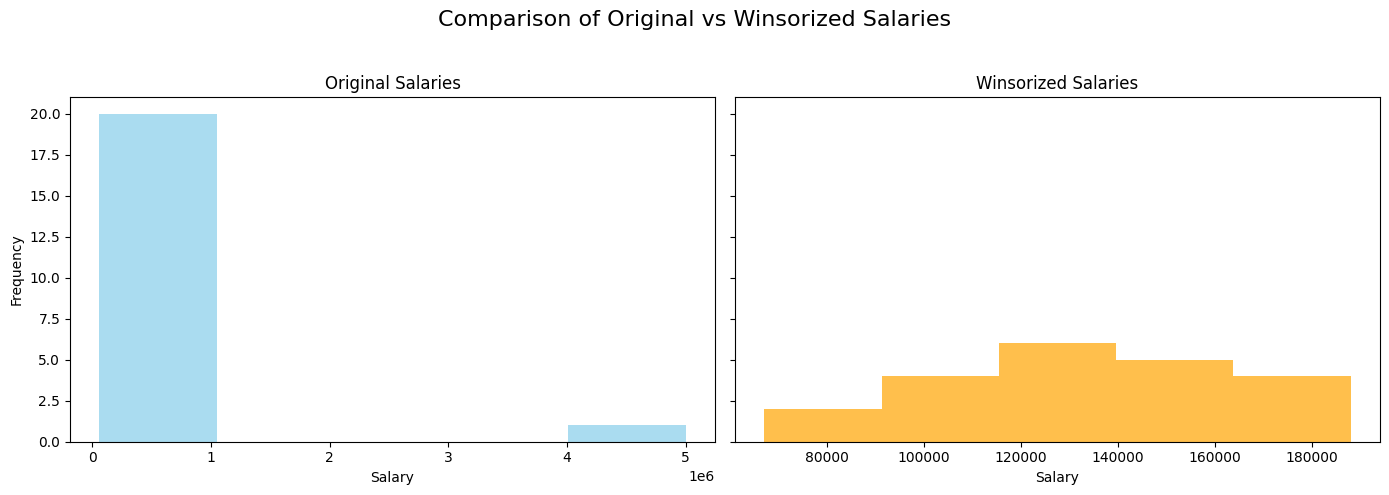
Here, the extreme salaries are replaced by the 10th and 90th percentile values, reducing the effect of the outlier.
Visualization: A histogram comparing the original and Winsorized salaries:
import matplotlib.pyplot as plt

fig, axes = plt.subplots(1, 2, figsize=(14,5), sharey=True)

# Original salary distribution
axes[0].hist(df_salaries["Salary"], bins=5, color="skyblue", alpha=0.7)
axes[0].set_title("Original Salaries")
axes[0].set_xlabel("Salary")
axes[0].set_ylabel("Frequency")

# Winsorized salary distribution
axes[1].hist(df_salaries["Salary_winsorized"], bins=5, color="orange", alpha=0.7)
axes[1].set_title("Winsorized Salaries")
axes[1].set_xlabel("Salary")

plt.suptitle("Comparison of Original vs Winsorized Salaries", fontsize=16)
plt.tight_layout(rect=[0, 0, 1, 0.95])
plt.show()
Tip
Similar to imputation, you can add an additional column (e.g., is_winsorized or is_clipped) to indicate that a value has been modified. This pattern often helps models by providing context and can lead to improved performance.