5.2.2. Data Quality Issues#
Often, our data may be complete, but inconsistencies can be hidden within it. Our goal is to identify these issues and handle them appropriately.
5.2.2.1. Data Standardization Issues#
Another common problem in datasets is standardization. Often, values in a column are not consistent. For analysis and modeling, you need consistent and correct types.
Examples include:
Inconsistent flags, such as
True,"T", or1, all meaning the same thing.Categorical values with inconsistent casing or formatting, like
"Green","GREEN", and"green"all referring to the same category.A numeric feature like
Agemight have some entries stored as strings - e.g.,"36"instead of36.Dates stored in different formats.
How to Approach This#
Inspect current data types
Start by checking what pandas has inferred for each column.Decide what the correct data type should be
Use domain knowledge or business context.
We saw in Summary Overview that you can view datatypes using .info().
Example: DataFrame with Dirty Numeric Values#
Let’s look at an example where numeric values are mixed with strings and extra characters:
import pandas as pd

data = {
    "ID": [1, 2, 3, 4],
    "Age": ["25", " 30", "thirty-five", "40"],
    "Salary": ["50000", "55000", None, "sixty thousand"]
}

df_dirty = pd.DataFrame(data)
df_dirty
| ID | Age | Salary | |
|---|---|---|---|
| 0 | 1 | 25 | 50000 |
| 1 | 2 | 30 | 55000 |
| 2 | 3 | thirty-five | None |
| 3 | 4 | 40 | sixty thousand |
# Show initial info
df_dirty.info()
<class 'pandas.core.frame.DataFrame'>
RangeIndex: 4 entries, 0 to 3
Data columns (total 3 columns):
 #   Column  Non-Null Count  Dtype
---  ------  --------------  -----
 0   ID      4 non-null      int64
 1   Age     4 non-null      object
 2   Salary  3 non-null      object
dtypes: int64(1), object(2)
memory usage: 228.0+ bytes
You can see:
Some entries have spaces (
" 30")Some have text (
"thirty-five")Some are
None
This is why the Age and Salary columns are object type.
Note
Pandas uses object for string columns, and also when it cannot clearly identify a more specific type.
Identifying Why Values Are Dirty#
You can quickly see which rows fail conversion to numeric. We will use the pd.to_numeric() method provided by pandas.
# Try to convert Age to numeric, forcing errors to NaN
df_dirty["Age_numeric"] = pd.to_numeric(df_dirty["Age"], errors="coerce")

# Show which values became NaN (problematic)
df_dirty[["Age", "Age_numeric"]]
| Age | Age_numeric | |
|---|---|---|
| 0 | 25 | 25.0 |
| 1 | 30 | 30.0 |
| 2 | thirty-five | NaN |
| 3 | 40 | 40.0 |
This helps you spot which rows need cleaning. We will look at cleaning up such values in the Data Type Handling section.
5.2.2.2. Data Imperfections#
When data is captured, stored, or transmitted, imperfections can creep in. These imperfections can distort values, leading to data corruption. In some cases, corrupted data can be repaired or worked around, but often it cannot be reliably used and must be discarded.
Noise#
The term noise refers to unintended modifications in the true, original values of the data. Noise can arise from imperfect data collection processes, human error, faulty sensors, or other random disturbances.
If noisy data is used without correction, the output of any analysis or model may be unreliable.
Example of noise:
If the Age column of a dataset contains a value of 202 for human data, we can confidently say this is incorrect. Such unrealistic values can mislead a model.
import pandas as pd

data = {"Name": ["Alice", "Bob", "Charlie"], "Age": [25, 202, 30]}
df = pd.DataFrame(data)
display(df)

# Identify noisy ages (e.g., > 120 is unrealistic for humans)
df[df["Age"] > 120]
| Name | Age | |
|---|---|---|
| 0 | Alice | 25 |
| 1 | Bob | 202 |
| 2 | Charlie | 30 |
| Name | Age | |
|---|---|---|
| 1 | Bob | 202 |
To address noise, data is typically cleaned (corrected where possible) or removed altogether.
Outliers#
Outliers are different from noise. They are genuine data points - not errors - but they are extremely unusual compared to the rest of the dataset. While valid, their presence can distort statistical measures (like the mean) and reduce a model’s ability to generalize.
Example: Suppose we have employee salary data where most salaries range from \(50K to \)200K, but the CEO earns $5M. That CEO’s salary is a true value but is far removed from the bulk of the data.
import numpy as np

salaries = [50000, 60000, 75000, 120000, 200000, 5000000]
df_salaries = pd.DataFrame(salaries, columns=["Salary"])
display(df_salaries)

# Basic stats to show impact of the outlier
print("Mean salary:", df_salaries["Salary"].mean())
print("Median salary:", df_salaries["Salary"].median())
| Salary | |
|---|---|
| 0 | 50000 |
| 1 | 60000 |
| 2 | 75000 |
| 3 | 120000 |
| 4 | 200000 |
| 5 | 5000000 |
Mean salary: 917500.0
Median salary: 97500.0
Notice how the mean is heavily skewed by the outlier, while the median better represents the majority of salaries.
Such outliers need special consideration, sometimes they are kept for completeness, and other times they are transformed, capped, or excluded depending on the analysis goal.
We will look at techniques to tackle them in the Handling Imperfections section.
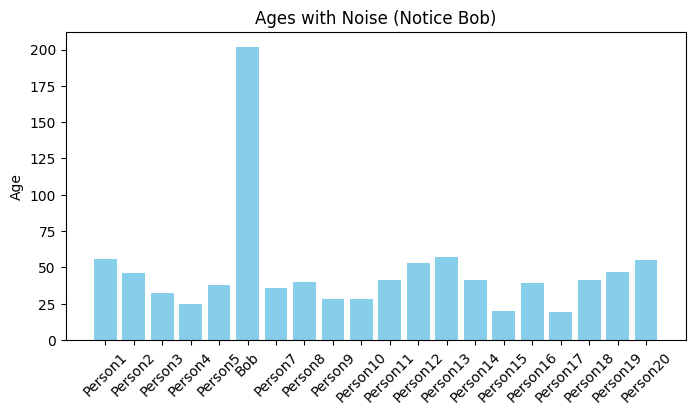
Noise and Outlier Visualization#
We can identify both noise as well as outliers using visualization methods. Let’s plot the data from both the examples after scaling it.
Histogram to visualize noise:
from matplotlib import pyplot as plt
import numpy as np

# Larger dataset for Ages
np.random.seed(42)
names = [f"Person{i}" for i in range(1, 21)]
ages = np.random.randint(18, 60, size=20).tolist()

# Introduce noise (Age = 202 for Bob)
names[5] = "Bob"
ages[5] = 202

df = pd.DataFrame({"Name": names, "Age": ages})

plt.figure(figsize=(8,4))
plt.bar(df["Name"], df["Age"], color="skyblue")
plt.title("Ages with Noise (Notice Bob)")
plt.ylabel("Age")
plt.xticks(rotation=45)
plt.show()
Boxplot to visualize outlier
# Larger dataset for Salaries
np.random.seed(0)
salaries = np.random.randint(50_000, 200_000, size=5000).tolist()

# Introduce outlier (CEO salary)
salaries.append(5_000_000)

df_salaries = pd.DataFrame({"Salary": salaries})

plt.figure(figsize=(8,4))
plt.boxplot(df_salaries["Salary"], vert=False)
plt.title("Salaries with Outlier (CEO)")
plt.xlabel("Salary")
plt.show()
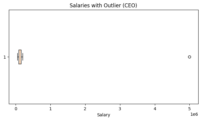
While this works, the visualization is not very intuitive - the CEO’s salary is so large that it compresses all other salaries into a thin line.
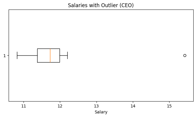
We can use logarithmic scale on the x-axis spreads out the data, letting us see both the bulk of the salaries and the outlier in the same plot.
Improved Visualization with Log Scale
plt.figure(figsize=(8,4))
plt.boxplot(df_salaries["Salary"].apply(np.log), vert=False)
plt.title("Salaries with Outlier (CEO)")
plt.xlabel("Salary")
plt.show()