CIS 6930 Spring 26
Data Engineering at the University of Florida
Evaluation Metrics: Interactive Visualizations & Code
This page contains animated visualizations and runnable code examples for understanding classification evaluation metrics. Use these resources to build intuition for ROC curves, Precision-Recall curves, and AUC.
Table of Contents
- Classification Threshold Animations
- ROC Curve Animations
- Precision-Recall Curve Animations
- Class Imbalance Effects
- Runnable Code Examples
- Quick Reference
Classification Threshold Animations
How Threshold Affects TPR and FPR
As we lower the classification threshold, we predict more positives. This increases both the True Positive Rate (TPR) and False Positive Rate (FPR).
Key insight: When we try to increase the true positive rate, we also increase the false positive rate. The ROC curve captures this trade-off at every threshold.
Source: Dariya Sydykova - ROC Animation
Precision, Recall, and Accuracy vs Threshold
This animation shows how precision, recall, and accuracy change as you adjust the classification threshold. Notice how precision and recall move in opposite directions.
Key insight: There is no single “best” threshold. The optimal threshold depends on whether you prioritize precision (fewer false positives) or recall (fewer false negatives).
Source: aslanismailgit/Medium-Blog—Metrics
Interactive: Threshold Explorer
For an interactive tool to explore how changing the classification threshold affects precision, recall, and other metrics, visit the Google ML Crash Course:
Google ML Crash Course: Classification Metrics
The interactive threshold explorer lets you drag a slider and observe how the confusion matrix and metrics change in real-time.
ROC Curve Animations
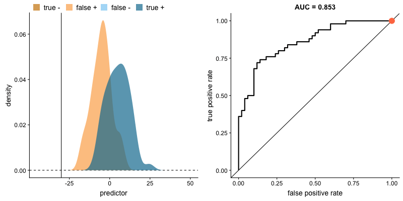
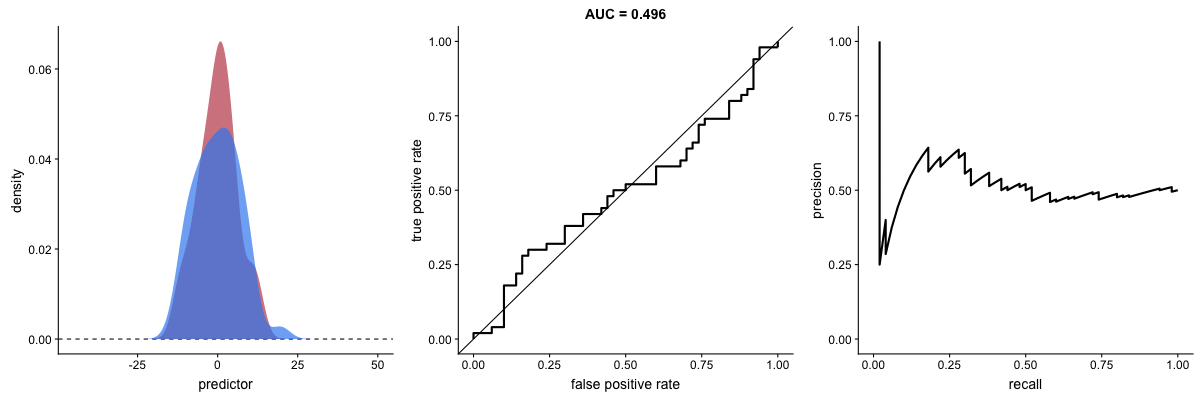
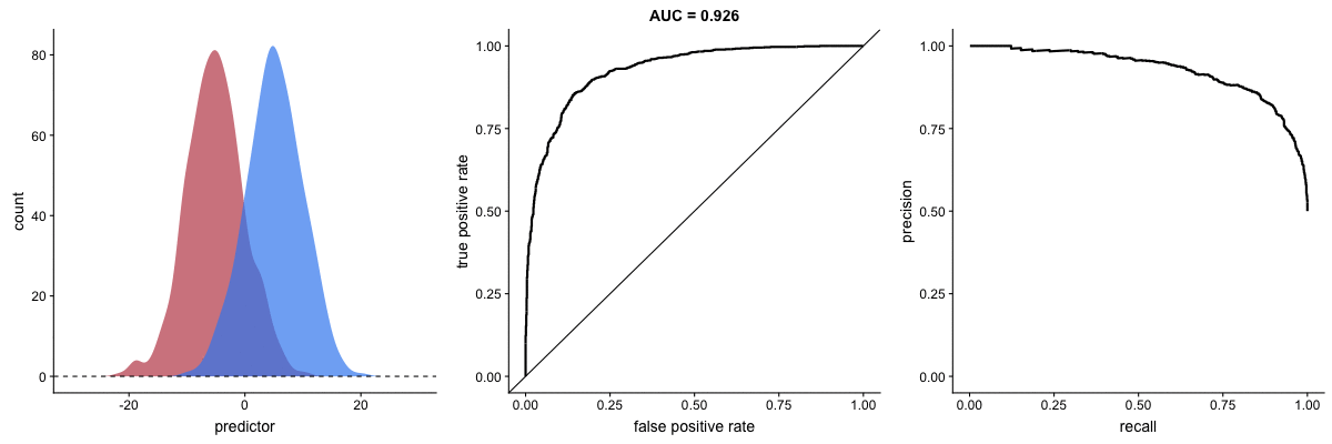
ROC Curve as Model Improves
This animation shows how the ROC curve changes as the model’s ability to separate classes improves. When the model can perfectly separate the two outcomes, the ROC curve forms a right angle and the AUC becomes 1.
Interpretation:
- Diagonal line: Random classifier (AUC = 0.5)
- Top-left corner: Perfect classifier (AUC = 1.0)
- Curve closer to top-left = better model
Source: Dariya Sydykova - ROC Animation
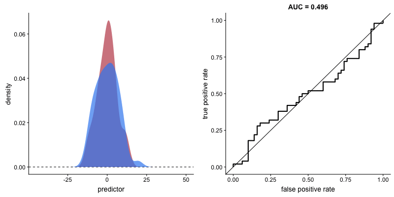
Effect of Standard Deviation on AUC
This animation reveals a critical limitation: AUC value can be misleading when outcome distribution variance changes. The AUC may indicate improved performance when actual prediction capability has degraded.
Source: Dariya Sydykova - ROC Animation
Precision-Recall Curve Animations
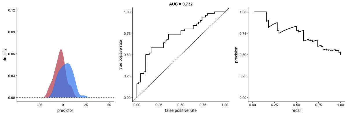
PR Curve as Model Improves
This animation shows how the Precision-Recall curve changes as the model improves. Better models produce curves approaching the top-right corner (high precision AND high recall).
Key difference from ROC:
- PR curve plots Recall (x-axis) vs Precision (y-axis)
- More sensitive to class imbalance
- Better for evaluating performance on rare positive classes
Source: Dariya Sydykova - ROC Animation
Class Imbalance Effects
Why PR Curves Matter for Imbalanced Data
These animations demonstrate that the precision-recall curve is more sensitive to class imbalance than an ROC curve. The PR curve changes shape drastically while ROC-AUC remains relatively stable.
Scenario 1: Moderate Imbalance
Scenario 2: Severe Imbalance

Key insight: For imbalanced datasets (fraud detection, rare diseases), PR-AUC is more informative than ROC-AUC because it doesn’t get “fooled” by the large number of true negatives.
Source: Dariya Sydykova - ROC Animation
Runnable Code Examples
Basic Metrics Calculation
This example demonstrates how to compute the four fundamental classification metrics from ground truth labels and model predictions. The function takes two arrays: the true labels and the predicted labels. It then calculates precision (what fraction of positive predictions were correct), recall (what fraction of actual positives were found), accuracy (overall correctness), and F1 score (the harmonic mean that balances precision and recall). The confusion matrix shows the raw counts of true positives, false positives, true negatives, and false negatives.
from sklearn.metrics import (
    precision_score, recall_score, accuracy_score,
    f1_score, confusion_matrix, classification_report
)
import numpy as np

def calc_metrics(y_true, y_pred):
    """Calculate and display classification metrics."""
    precision = precision_score(y_true, y_pred)
    recall = recall_score(y_true, y_pred)
    accuracy = accuracy_score(y_true, y_pred)
    f1 = f1_score(y_true, y_pred)

    print(f"PRECISION: Model's positive claims are {100*precision:.0f}% correct")
    print(f"RECALL: Model correctly predicts {100*recall:.0f}% of total positives")
    print(f"ACCURACY: Model's accuracy is {100*accuracy:.0f}%")
    print(f"F1 SCORE: Harmonic mean of precision and recall: {f1:.2f}")

    return precision, recall, accuracy, f1

# Example usage
y_true = [0, 0, 0, 0, 0, 1, 1, 1, 1, 1]
y_pred = [0, 0, 0, 1, 1, 1, 1, 1, 0, 0]

calc_metrics(y_true, y_pred)
print("\nConfusion Matrix:")
print(confusion_matrix(y_true, y_pred))
print("\nClassification Report:")
print(classification_report(y_true, y_pred))
Adapted from: aslanismailgit/Medium-Blog—Metrics
Plotting ROC and PR Curves
This example shows the complete workflow for visualizing model performance using ROC and Precision-Recall curves. The code generates a synthetic imbalanced dataset where only 10% of samples belong to the positive class. A logistic regression model is trained with balanced class weights to handle the imbalance. The example then plots both curves side by side. The ROC curve shows how the true positive rate changes relative to the false positive rate at different thresholds. The PR curve shows the precision-recall tradeoff. Both curves include their respective AUC scores, which summarize overall model performance in a single number.
import numpy as np
import matplotlib.pyplot as plt
from sklearn.datasets import make_classification
from sklearn.model_selection import train_test_split
from sklearn.linear_model import LogisticRegression
from sklearn.metrics import (
    RocCurveDisplay, PrecisionRecallDisplay,
    roc_auc_score, average_precision_score
)

# Create imbalanced dataset (10% positive class)
X, y = make_classification(
    n_samples=1000,
    n_features=20,
    n_informative=10,
    weights=[0.9, 0.1],  # 90% negative, 10% positive
    random_state=42
)

# Split data
X_train, X_test, y_train, y_test = train_test_split(
    X, y, test_size=0.3, stratify=y, random_state=42
)

# Train model with balanced class weights
model = LogisticRegression(class_weight='balanced', max_iter=1000)
model.fit(X_train, y_train)

# Get predictions and probabilities
y_pred = model.predict(X_test)
y_proba = model.predict_proba(X_test)[:, 1]

# Calculate AUC scores
roc_auc = roc_auc_score(y_test, y_proba)
pr_auc = average_precision_score(y_test, y_proba)

print(f"ROC-AUC: {roc_auc:.3f}")
print(f"PR-AUC:  {pr_auc:.3f}")

# Plot both curves side by side
fig, (ax1, ax2) = plt.subplots(1, 2, figsize=(12, 5))

# ROC Curve
RocCurveDisplay.from_estimator(
    model, X_test, y_test,
    ax=ax1,
    name=f"Logistic Regression (AUC={roc_auc:.2f})"
)
ax1.plot([0, 1], [0, 1], 'k--', label='Random (AUC=0.5)')
ax1.set_title("ROC Curve")
ax1.legend()

# Precision-Recall Curve
PrecisionRecallDisplay.from_estimator(
    model, X_test, y_test,
    ax=ax2,
    name=f"Logistic Regression (AP={pr_auc:.2f})"
)
ax2.set_title("Precision-Recall Curve")

plt.tight_layout()
plt.savefig("roc_pr_comparison.png", dpi=150)
plt.show()
Based on: scikit-learn Precision-Recall Example
Multi-Class Precision-Recall Curves
Binary classification metrics extend naturally to multi-class problems using the one-vs-rest approach. This example uses the Iris dataset with three flower species. The code binarizes the labels so each class becomes a separate binary classification problem. Noise features are added to make the classification more challenging. A separate PR curve is plotted for each class, showing how well the model distinguishes that class from all others. The Average Precision (AP) score for each class indicates how well the model ranks samples of that class higher than samples from other classes.
import numpy as np
import matplotlib.pyplot as plt
from sklearn.datasets import load_iris
from sklearn.model_selection import train_test_split
from sklearn.preprocessing import StandardScaler, label_binarize
from sklearn.multiclass import OneVsRestClassifier
from sklearn.linear_model import LogisticRegression
from sklearn.metrics import precision_recall_curve, average_precision_score
from itertools import cycle

# Load iris dataset
X, y = load_iris(return_X_y=True)

# Binarize labels for multi-label classification
Y = label_binarize(y, classes=[0, 1, 2])
n_classes = Y.shape[1]

# Add noise features to make problem harder
random_state = np.random.RandomState(42)
n_samples, n_features = X.shape
X = np.concatenate([X, random_state.randn(n_samples, 20 * n_features)], axis=1)

# Split data
X_train, X_test, Y_train, Y_test = train_test_split(
    X, Y, test_size=0.5, random_state=42
)

# Train OneVsRest classifier
classifier = OneVsRestClassifier(
    LogisticRegression(max_iter=1000, random_state=42)
)
classifier.fit(X_train, Y_train)
y_score = classifier.predict_proba(X_test)

# Calculate metrics for each class
precision = {}
recall = {}
average_precision = {}

for i in range(n_classes):
    precision[i], recall[i], _ = precision_recall_curve(Y_test[:, i], y_score[:, i])
    average_precision[i] = average_precision_score(Y_test[:, i], y_score[:, i])

# Plot
plt.figure(figsize=(8, 6))
colors = cycle(['navy', 'turquoise', 'darkorange'])
class_names = ['Setosa', 'Versicolor', 'Virginica']

for i, color in zip(range(n_classes), colors):
    plt.plot(
        recall[i], precision[i],
        color=color, lw=2,
        label=f'{class_names[i]} (AP={average_precision[i]:.2f})'
    )

plt.xlabel('Recall')
plt.ylabel('Precision')
plt.title('Multi-class Precision-Recall Curve')
plt.legend(loc='best')
plt.xlim([0.0, 1.0])
plt.ylim([0.0, 1.05])
plt.grid(True, alpha=0.3)
plt.savefig("multiclass_pr.png", dpi=150)
plt.show()
Threshold Tuning for Optimal F1
Most classifiers output probabilities rather than hard predictions. The default threshold of 0.5 converts these probabilities to class labels, but this threshold is rarely optimal. This example demonstrates how to find the best threshold for maximizing F1 score. The code trains a model, extracts probability scores, and then evaluates precision, recall, and F1 at many different thresholds. The resulting plot shows how these metrics change as the threshold varies. Lowering the threshold increases recall but decreases precision. The optimal threshold balances these competing objectives based on your specific requirements.
import numpy as np
import matplotlib.pyplot as plt
from sklearn.datasets import make_classification
from sklearn.model_selection import train_test_split
from sklearn.linear_model import LogisticRegression
from sklearn.metrics import f1_score, precision_score, recall_score

# Create imbalanced dataset
X, y = make_classification(
    n_samples=1000, weights=[0.9, 0.1], random_state=42
)
X_train, X_test, y_train, y_test = train_test_split(
    X, y, test_size=0.3, stratify=y, random_state=42
)

# Train model
model = LogisticRegression(max_iter=1000)
model.fit(X_train, y_train)

# Get probabilities
y_proba = model.predict_proba(X_test)[:, 1]

# Test different thresholds
thresholds = np.arange(0.1, 0.95, 0.05)
f1_scores = []
precisions = []
recalls = []

for threshold in thresholds:
    y_pred = (y_proba >= threshold).astype(int)
    f1_scores.append(f1_score(y_test, y_pred))
    precisions.append(precision_score(y_test, y_pred, zero_division=0))
    recalls.append(recall_score(y_test, y_pred))

# Find optimal threshold
best_idx = np.argmax(f1_scores)
best_threshold = thresholds[best_idx]
best_f1 = f1_scores[best_idx]

print(f"Default threshold (0.5) F1: {f1_score(y_test, model.predict(X_test)):.3f}")
print(f"Optimal threshold: {best_threshold:.2f}")
print(f"Optimal F1 score: {best_f1:.3f}")

# Plot
plt.figure(figsize=(10, 6))
plt.plot(thresholds, f1_scores, 'b-', linewidth=2, label='F1 Score')
plt.plot(thresholds, precisions, 'g--', linewidth=2, label='Precision')
plt.plot(thresholds, recalls, 'r--', linewidth=2, label='Recall')
plt.axvline(x=best_threshold, color='purple', linestyle=':',
            label=f'Optimal Threshold ({best_threshold:.2f})')
plt.axvline(x=0.5, color='gray', linestyle=':', alpha=0.5,
            label='Default Threshold (0.5)')
plt.xlabel('Classification Threshold')
plt.ylabel('Score')
plt.title('Threshold Tuning: Finding Optimal F1')
plt.legend()
plt.grid(True, alpha=0.3)
plt.savefig("threshold_tuning.png", dpi=150)
plt.show()
Cost-Sensitive Evaluation
Standard metrics treat all errors equally, but real applications often have asymmetric costs. In fraud detection, missing a fraudulent transaction (false negative) might cost $500 in losses, while blocking a legitimate transaction (false positive) might only cost $50 in customer service time. This example shows how to incorporate these costs into model training and evaluation. The code defines explicit costs for each error type, creates a custom scoring function that computes total cost, and compares a standard model against one trained with class weights proportional to the cost ratio. The cost-weighted model sacrifices some overall accuracy to reduce expensive false negatives.
import numpy as np
from sklearn.datasets import make_classification
from sklearn.model_selection import train_test_split
from sklearn.linear_model import LogisticRegression
from sklearn.metrics import confusion_matrix, make_scorer
from sklearn.model_selection import GridSearchCV

# Create dataset
X, y = make_classification(
    n_samples=1000, weights=[0.9, 0.1], random_state=42
)
X_train, X_test, y_train, y_test = train_test_split(
    X, y, test_size=0.3, stratify=y, random_state=42
)

# Define costs
cost_FP = 50   # Cost of false positive (e.g., customer inconvenience)
cost_FN = 500  # Cost of false negative (e.g., fraud loss)

def cost_score(y_true, y_pred):
    """Calculate total cost (negative because sklearn maximizes)."""
    tn, fp, fn, tp = confusion_matrix(y_true, y_pred).ravel()
    total_cost = fp * cost_FP + fn * cost_FN
    return -total_cost  # Negative because sklearn maximizes

# Create custom scorer
cost_scorer = make_scorer(cost_score)

# Compare: standard model vs cost-weighted model
model_standard = LogisticRegression(max_iter=1000)
model_weighted = LogisticRegression(
    class_weight={0: 1, 1: cost_FN/cost_FP},  # Weight ratio
    max_iter=1000
)

model_standard.fit(X_train, y_train)
model_weighted.fit(X_train, y_train)

# Evaluate both
for name, model in [("Standard", model_standard), ("Cost-Weighted", model_weighted)]:
    y_pred = model.predict(X_test)
    tn, fp, fn, tp = confusion_matrix(y_test, y_pred).ravel()
    total_cost = fp * cost_FP + fn * cost_FN

    print(f"\n{name} Model:")
    print(f"  TP: {tp}, FP: {fp}, FN: {fn}, TN: {tn}")
    print(f"  Total Cost: ${total_cost:,}")
    print(f"  Cost breakdown: FP=${fp * cost_FP:,} + FN=${fn * cost_FN:,}")
Quick Reference
When to Use Each Metric
| Metric | Formula | Best For |
|---|---|---|
| Accuracy | (TP+TN) / Total | Balanced classes only |
| Precision | TP / (TP+FP) | When FP is costly (spam filter) |
| Recall | TP / (TP+FN) | When FN is costly (disease detection) |
| F1 Score | 2×(P×R)/(P+R) | Balance precision and recall |
| ROC-AUC | Area under ROC | General comparison, balanced data |
| PR-AUC | Area under PR | Imbalanced data, rare positive class |
Key sklearn Functions
from sklearn.metrics import (
    # Basic metrics
    accuracy_score,
    precision_score,
    recall_score,
    f1_score,

    # Curve metrics
    roc_auc_score,
    average_precision_score,  # PR-AUC

    # Curve data
    roc_curve,
    precision_recall_curve,

    # Visualization
    RocCurveDisplay,
    PrecisionRecallDisplay,
    ConfusionMatrixDisplay,

    # Reports
    classification_report,
    confusion_matrix
)
Additional Resources
- Google ML Crash Course: Classification
- Machine Learning Mastery: ROC and PR Curves for Imbalanced Classification
- Arize AI: What is PR-AUC?
- scikit-learn: Model Evaluation
- Dariya Sydykova: ROC Animation Repository
This page accompanies the Day 16 lecture on Evaluation Metrics & Model Selection.